


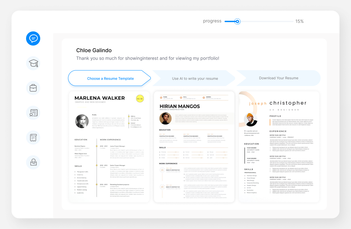
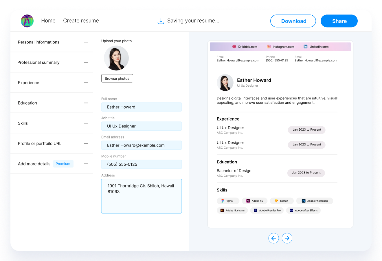
Introduction
In this comprehensive guide, we equip you with the essential knowledge to master the art of choosing the perfect font for your resume in 2024. Your resume is often the first impression you make on potential employers, and the font you select can significantly impact how it's perceived. Whether you're aiming to convey professionalism, creativity, or industry-specific expertise, we'll delve into the intricacies of font size, style, and industry recommendations. We'll also explore the critical aspect of ATS compatibility in today's digital age. With insights into the top resume fonts for 2024 and industry-specific recommendations, you'll gain the confidence to craft a standout resume that leaves a lasting impression on hiring managers and ATS systems alike.
How Fonts Influence Professional Perception in 2024
The year 2024 has seen a shift in how employers view resumes. With remote work and digital portfolios becoming more prevalent, the way your resume looks on screen is as important as its content. The right font can make your resume appear more professional and readable, while the wrong choice can make it look outdated or hard to read. Fonts convey subtle messages: a classic serif font might suggest traditional professionalism, whereas a modern sans-serif can project a more contemporary, dynamic personality.
Font Size
Optimal Font Size for Readability and Professionalism
The font size on your resume plays a pivotal role in its readability. Generally, a font size between 10 to 12 points is recommended. This range strikes a balance between readability and efficient use of space. A smaller font might be tempting to fit more content, but it can be challenging to read, especially on digital screens. Conversely, a font too large can make your resume look sparse and underwhelming.
Exceptions to the Rule: When to Adjust Font Size
However, there are exceptions. For instance, if you're in a creative field, playing with slightly larger font sizes for headers or certain sections can add a design element to your resume. In contrast, more conservative fields might prefer sticking strictly to the 10-12 point range. Additionally, consider the overall length of your resume. If you have extensive experience and need more space, you might opt for a slightly smaller font, but never go below 9 points.
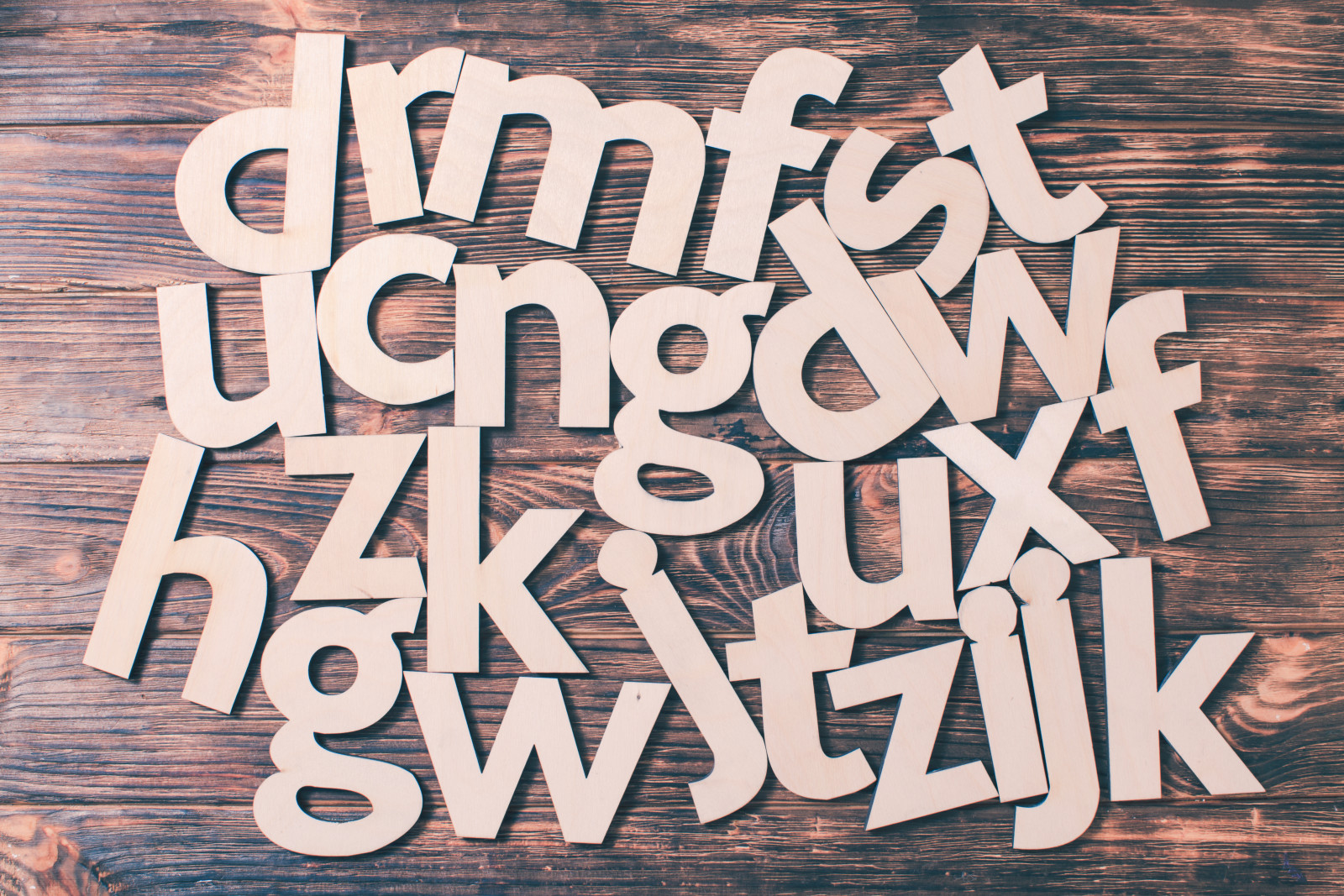
Font Style
Classic vs. Modern Fonts: Making the Right Choice
When selecting a font style, the choice between classic and modern fonts sets the tone of your resume. Classic fonts like Times New Roman or Garamond are synonymous with professionalism and tradition, ideal for industries like law or finance. Modern fonts, such as Helvetica or Calibri, project a more contemporary vibe, suitable for tech or design fields. Your choice should reflect the industry you're targeting and the image you want to project.
Serif vs. Sans Serif Fonts: Pros and Cons
The debate between serif and sans serif fonts is ongoing. Serif fonts, characterized by small lines or strokes at the ends of letters, are traditional and easy to read in print. They are often seen as more formal. Sans serif fonts, without these lines, offer a cleaner and more modern look, typically easier to read on screens.
-
Serif Pros: Perceived as professional, easy on the eyes for printed resumes.
-
Sans Serif Pros: Modern, clean, and more legible on digital screens.
Unique Font Styles: When and How to Use Them
While standard fonts are a safe bet, unique font styles can be used to make a statement, especially in creative industries. Fonts like Georgia or Avenir can provide a mix of classic and modern feels. However, it's crucial to ensure readability and professionalism. Reserve unique fonts for headers or your name, keeping the body of the resume in a more traditional font.
For a creative resume:
Name and Header: Playfair Display
Body: Calibri
Top 20 Resume Fonts for 2024
Timeless Elegance: Top 5 Classic Fonts
-
Times New Roman: The epitome of traditional professionalism, perfect for law, finance, or academia.
-
Garamond: Elegant and less common than Times New Roman, offering a classic look without being clich 茅.
-
Cambria: Designed for readability on screen, ideal for both printed and digital resumes.
-
Georgia: A serif font that's both professional and modern, great for a variety of industries.
-
Baskerville: An older serif font that conveys credibility and reliability, suitable for senior positions.
Modern Edge: Top 5 Contemporary Fonts
-
Helvetica: A sans-serif font favored for its clean lines and professional appearance, widely used in corporate and creative fields.
-
Calibri: The default font for Microsoft Word; it's familiar, modern, and versatile.
-
Arial: A staple for digital readability, ideal for tech-focused roles.
-
Verdana: Known for its wide spacing, making it easy to read on any screen.
-
Lato: A sans-serif font that combines professionalism with a friendly appearance.
Reader-Friendly: Top 5 Sans Serif Fonts
-
Roboto: A Google font, known for its universal readability and modern look.
-
Open Sans: A neutral and friendly font, great for digital platforms.
-
Noto Sans: Designed to support all languages, perfect for international applications.
-
Futura: A geometric sans-serif font, offers a crisp, forward-looking aesthetic.
-
Franklin Gothic: Strong and assertive, suitable for headers or titles.
Personality and Flair: Top 5 Unique Fonts
-
Playfair Display: Offers a modern take on traditional serif fonts, great for creative industries.
-
Avenir: A geometric sans-serif font that conveys professionalism with a twist.
-
Montserrat: A contemporary font that's both elegant and readable.
-
Raleway: Stylish and sophisticated, ideal for design-oriented resumes.
-
Didot: A serif font that exudes luxury, best used for headers or name to add a touch of elegance.
Industry-Specific Font Recommendations
Corporate Fields: Conservative and Professional
In corporate settings like banking, law, or business management, traditional and conservative fonts are preferred. These industries value professionalism and clarity.
-
Serif Fonts: Times New Roman, Garamond
-
Sans Serif Fonts: Arial, Helvetica
Creative Industries: Artistic and Expressive Fonts
For fields like graphic design, advertising, or fashion, your font can be a reflection of your creativity.
-
Unique Serif Fonts: Playfair Display, Didot
-
Stylish Sans Serif Fonts: Lato, Raleway
Technical Fields: Clear and Functional Fonts
Technical roles, such as engineering or IT, require fonts that are clear and easy to read, reflecting precision and clarity.
-
Straightforward Serif Fonts: Cambria, Georgia
-
Functional Sans Serif Fonts: Roboto, Verdana
Healthcare and Education: Trustworthy and Accessible Fonts
Professions in healthcare and education benefit from fonts that are trustworthy and accessible, conveying a sense of care and responsibility.
-
Friendly Serif Fonts: Baskerville, Book Antiqua
-
Readable Sans Serif Fonts: Open Sans, Noto Sans
Utilizing Font Pairings
Effective Pairing Strategies for Resume Fonts
Pairing fonts can add a dynamic and polished look to your resume. The key is to combine fonts that complement each other while ensuring readability. A common strategy is to pair a serif font for headings with a sans-serif for body text, or vice versa. This contrast can make your resume more visually appealing and guide the reader's eye through the content.
Examples of Successful Font Combinations
-
Garamond (Headings) and Arial (Body): A classic and modern mix, suitable for traditional industries.
-
Helvetica (Headings) and Georgia (Body): Combines crisp modernity with a touch of elegance.
-
Playfair Display (Headings) and Open Sans (Body): Perfect for creative fields, offering flair and readability.
-
Cambria (Headings) and Calibri (Body): A professional and harmonious pairing for corporate resumes.
Effective Font Pairing Example:
Headings: Helvetica - bold and simple
Body Text: Georgia - elegant and easy to read
Formatting and Layout Tips
Balancing Fonts with Overall Resume Design
Your resume's layout should complement your font choices, creating a cohesive and appealing visual presentation. Key considerations include:
-
Margins: Ensure they are balanced and leave enough white space.
-
Spacing: Use consistent spacing between headings, sections, and lines.
-
Hierarchy: Employ font sizes and weights strategically to draw attention to key areas, like your name and section headings.
Ensuring Consistency in Font Usage
Consistency in font usage is crucial for a professional appearance. Stick to one or two fonts throughout your resume. If you use a different font for headings, make sure it's consistently applied across all headings. Likewise, maintain a uniform font for the body text. This consistency helps in creating a polished and organized document.
Correct Example:
Times New Roman for body text and Arial for headings, used consistently throughout the resume.
Incorrect Example:
Mixing multiple fonts like Garamond, Helvetica, and Comic Sans in various sections of the resume.
Accessibility and Universality
Choosing Fonts for Global and Diverse Audiences
In a globalized job market, it's essential to choose fonts that are accessible and readable to diverse audiences. Fonts like Arial, Helvetica, and Noto Sans are designed for clarity and readability in multiple languages, making them ideal choices for international applications. Additionally, consider the compatibility of your font with various digital platforms and devices to ensure your resume looks consistent everywhere.
Fonts and ATS Compatibility: What You Need to Know
Many organizations use Applicant Tracking Systems (ATS) to screen resumes. Certain fonts are more ATS-friendly, ensuring your resume is accurately scanned and processed. Simple, standard fonts like Times New Roman, Arial, and Calibri are often preferred for ATS compatibility. Avoid using overly stylized or decorative fonts, as they can confuse these systems.
Summary
Key Takeaways: The Power of the Right Font
Choosing the right font for your resume is a crucial element in making a positive first impression. Remember:
-
Font Size Matters: Stick to 10-12 points for optimal readability.
-
Style Reflects Personality: Choose a font that aligns with your industry and personal brand.
-
Consistency is Key: Use one or two fonts consistently across your resume.
-
Accessibility Counts: Opt for fonts that are readable, ATS-friendly, and suitable for a global audience.
Looking Ahead: Font Trends in the Job Market
As we move forward, the trends in resume fonts will continue to evolve. The focus on digital readability and ATS compatibility will likely increase. Fonts that balance a professional look with personality and innovation will be in demand. Staying informed about these trends will help you ensure your resume remains relevant and effective.
FAQs
Q: Can the Wrong Font Sabotage My Job Application?
Yes, the wrong font can negatively impact your job application. Fonts that are hard to read, unprofessional, or not ATS-friendly can cause your resume to be overlooked. Stick to professional, legible fonts to make the best impression.
Q: How Often Should I Update My Resume Font?
You should review and possibly update your resume font every few years to ensure it stays current with trends and maintains readability. However, frequent changes are unnecessary unless there's a significant shift in font trends or industry standards.
Q: Are Creative Fonts Acceptable in Traditional Industries?
Generally, traditional industries prefer more conservative fonts like Times New Roman or Arial. However, a touch of creativity in headings can be acceptable if done subtly and professionally.
Q: What Is the Best Font Size for Online Resumes?
For online resumes, stick to a font size between 10 and 12 points. This range ensures readability across various devices and screen resolutions.
Q: How Do I Choose a Font That Reflects My Personal Brand?
Choose a font that aligns with your industry and personal characteristics. If you're in a creative field, a modern or unique font can showcase your creativity. In more conservative fields, stick to classic, tried-and-true fonts.

Recommended Reading


